Better-for-you snacks · Gen-Z bold
SNACC
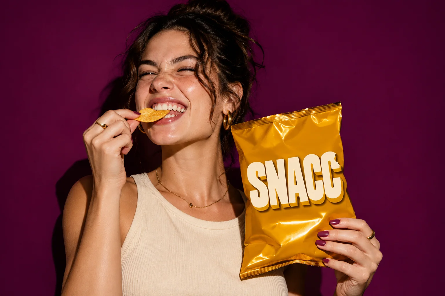
Crunchy snacks with a big mouth.
The brief
A better-for-you chip brand kept getting mistaken for a diet product. The team wanted shelf presence that said 'fun' first and 'healthier' second.
The idea
Chunky condensed type, a plum base and three loud flavour colours. Headlines that shout, packs that look like posters.
- Bold
- Punchy
- Snackable
The identity.
Mark, colour and type, pinned to one board.
Aa
Display A heavy condensed display face with a drop shadow
Body A sturdy grotesk
- Plum#5a0029
- Tangerine#ff4f00
- Grape#a43cc4
- Mustard#ffcf00
How we did it.
Four moves that make the brand what it is.
- 01
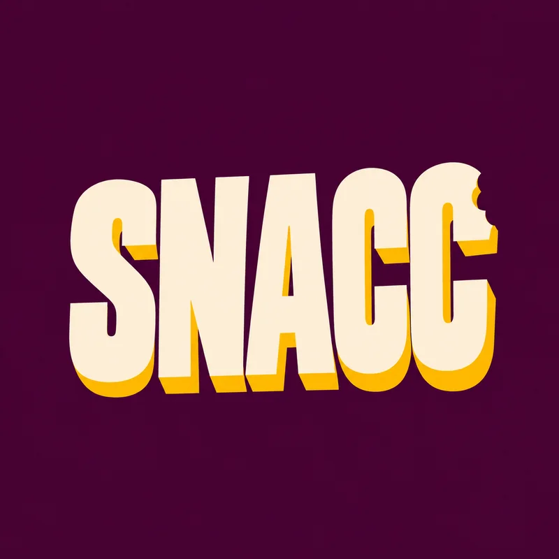
A wordmark with a shadow
Condensed, heavy letters with a hard mustard drop shadow that reads from a moving car.
- 02
Flavour as colour
Tangerine, grape and mustard bags on a deep plum base: one system, instantly a family.
- 03
Posters, not packs
Every bag is designed like a poster, so the shelf becomes the campaign.
- 04
Stories that crunch
A story-ad system built on three words and a close-up of the crunch.
In the world.
The identity on the things people actually touch.
The feed.
Nine posts that read as one brand at a glance.
SNACC
Better-for-you snacks
Crunchy snacks with a big mouth.
A content system, not nine pictures: product, type, colour and detail posts in a fixed rhythm, so the grid stays SNACC whoever posts next.
Delivered.
Everything the brand needs to launch, in files the team can use the same day.
- Logo and type system
- Pack design
- Story ads
- Out-of-home posters
More in food & drink.
5 brands in this group, each in its own style.
Want a brand like SNACC?
Tell us about your business in two minutes. We reply within a day with a clear direction and a quote.