Neighbourhood bakery · Playful
Loaf Society
Bread worth getting up for.
The brief
A sourdough bakery opening its second and third shops wanted a brand that felt handmade but could be printed on a thousand bags without looking rough.
The idea
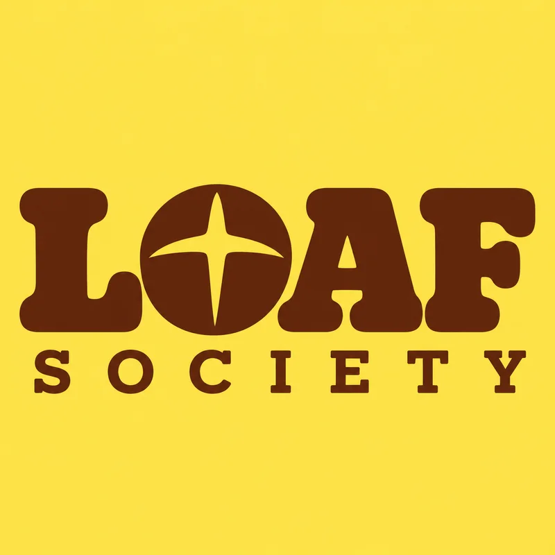
A chunky, soft-cornered serif wordmark that looks baked, with the O shaped like a scored loaf, and one-colour linocut illustrations instead of photography.
- Warm
- Handmade
- Cheerful
The identity.
Mark, colour and type, pinned to one board.
Aa
Display A chunky soft-cornered serif
Body A rounded sans
- Butter#f6c84c
- Cocoa#4a2c1a
- Flour#fbf4e6
- Jam#c8453a
How we did it.
Four moves that make the brand what it is.
- 01
The O is a loaf
A heavy, soft-cornered serif wordmark where the O in LOAF is a scored sourdough top. Set tight, stacked, printed in cocoa.
- 02
Butter and cocoa
Two colours carry everything: butter yellow paper, cocoa brown ink.
- 03
Illustrated world
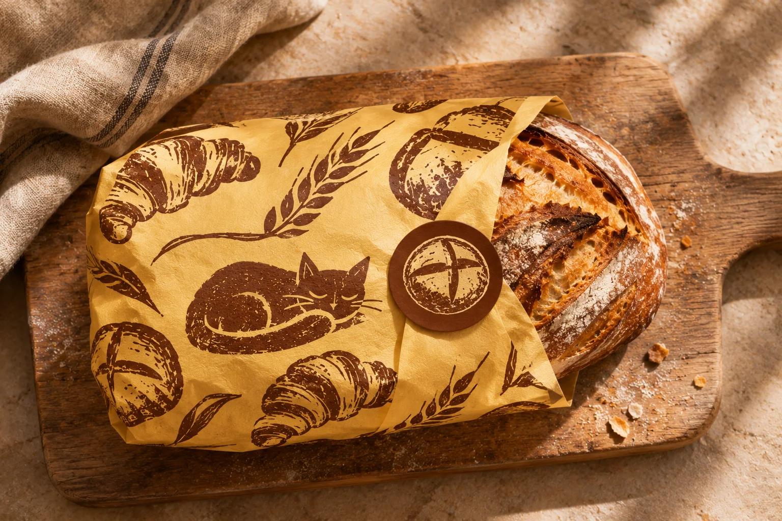
Croissants, baguettes and a bakery cat become a repeat pattern for bags and wrap.
- 04
Shop as poster
Chalk-style signage, window vinyl and bread tags all set in the same hand.
In the world.
The identity on the things people actually touch.
The feed.
Nine posts that read as one brand at a glance.
Loaf Society
Neighbourhood bakery
Bread worth getting up for.
A content system, not nine pictures: product, type, colour and detail posts in a fixed rhythm, so the grid stays Loaf Society whoever posts next.
Delivered.
Everything the brand needs to launch, in files the team can use the same day.
- Wordmark and loaf mark
- Bags, wrap and tags
- Linocut pattern
- Shop signage
More in food & drink.
5 brands in this group, each in its own style.
Want a brand like Loaf Society?
Tell us about your business in two minutes. We reply within a day with a clear direction and a quote.