Matcha café · Playful
mellow
A matcha bar that feels like a deep breath.
The brief
A small matcha café chain wanted a brand that could grow from one counter to twenty without losing its softness. Most matcha brands lean clinical green; this one needed warmth.
The idea
Soft, puffy letters and a smiling matcha cup with little legs. Cobalt blue instead of green, so the matcha itself becomes the only green in the frame.
- Soft
- Friendly
- Fresh
The identity.
Mark, colour and type, pinned to one board.
Aa
Display A soft, puffy rounded display face
Body A clean humanist sans
- Cobalt#2f5fd0
- Mint#b9e4c9
- Vanilla#f6ecc4
- Olive#343b1b
How we did it.
Four moves that make the brand what it is.
- 01
Puffy lowercase
A blobby, rounded wordmark that feels like foam, always lowercase, always relaxed.
- 02
A mascot with legs
The matcha cup walks, waves and naps across cups, signs and aprons.
- 03
Blue, not green
Electric cobalt, mint and vanilla. The drink supplies the green.
- 04
Built for repetition
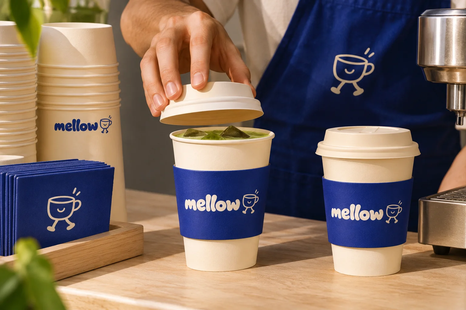
Cups, signage, aprons and cans share one system, so every new shop looks like the first.
In the world.
The identity on the things people actually touch.
The feed.
Nine posts that read as one brand at a glance.
mellow
Matcha café
A matcha bar that feels like a deep breath.
A content system, not nine pictures: product, type, colour and detail posts in a fixed rhythm, so the grid stays mellow whoever posts next.
Delivered.
Everything the brand needs to launch, in files the team can use the same day.
- Logotype and mascot
- Cups and packaging
- Shop signage
- Uniforms and merch
More in food & drink.
5 brands in this group, each in its own style.
Want a brand like mellow?
Tell us about your business in two minutes. We reply within a day with a clear direction and a quote.