Specialty coffee roastery · Minimal
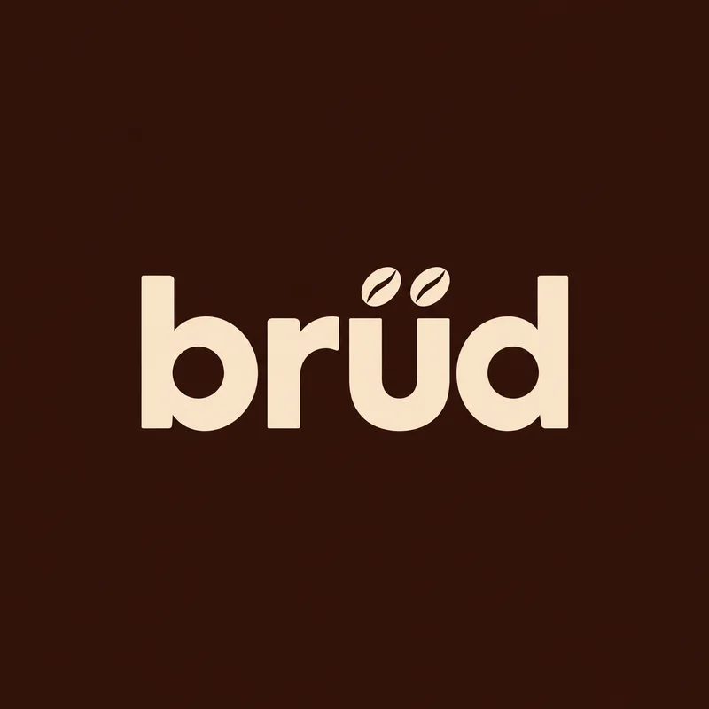
brüd
Coffee roasted with Nordic patience.
The brief
A small-batch roastery with Scandinavian roots and a Dubai café wanted packaging that looked at home on a design-shop shelf, not a supermarket one.
The idea
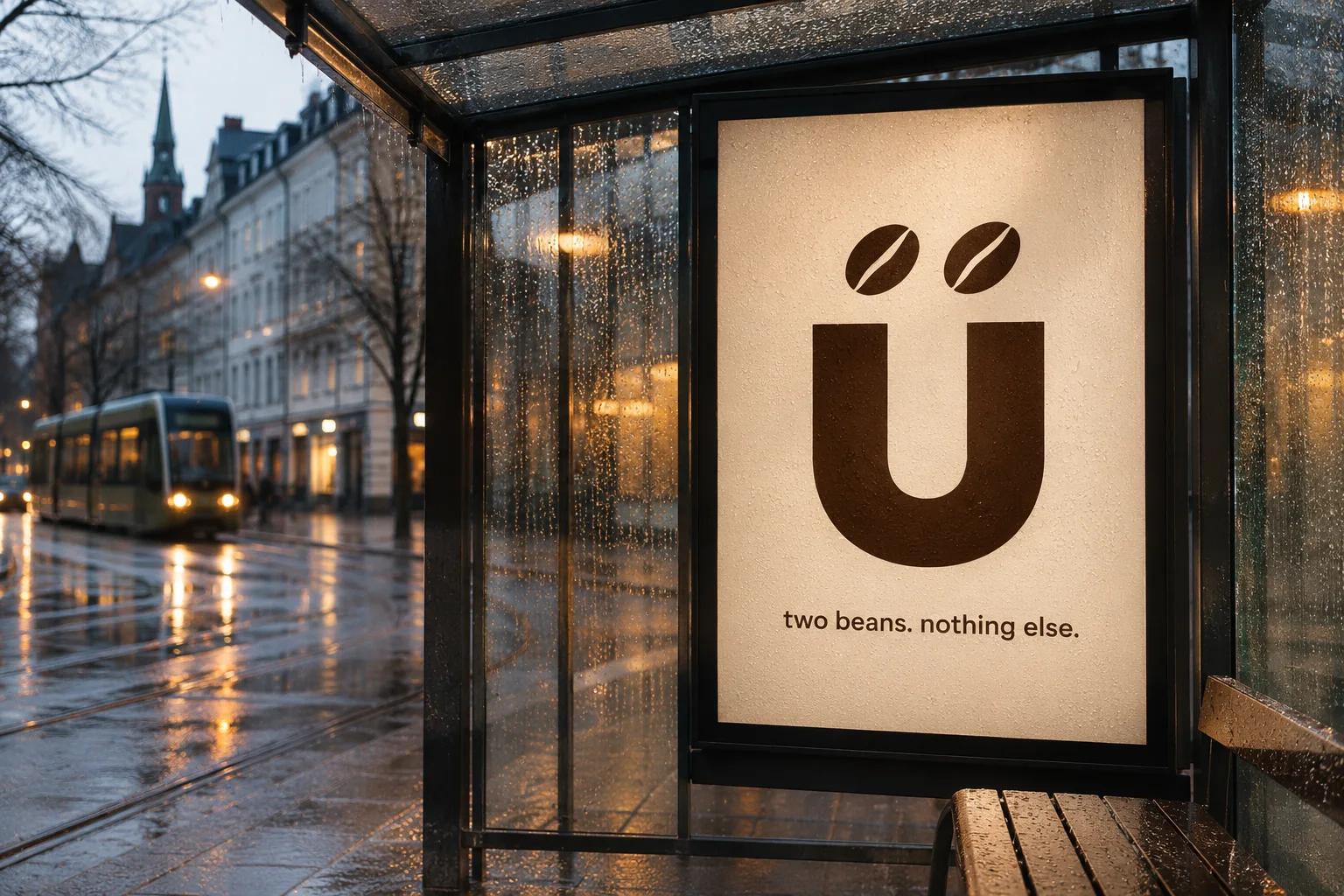
Quiet confidence. A custom lowercase wordmark whose umlaut is two coffee beans, debossed into kraft, and an origin label system set like a lab report.
- Quiet
- Warm
- Precise
The identity.
Mark, colour and type, pinned to one board.
Aa
Display A geometric lowercase sans
Body A quiet serif for origin notes
- Espresso#2b1d16
- Kraft#c9a88a
- Cream#f3ece2
- Clay#a0563a
How we did it.
Four moves that make the brand what it is.
- 01
Two beans for an umlaut
A custom-drawn lowercase wordmark with soft ink-trap notches; the ü carries two coffee beans instead of dots.
- 02
Paper and espresso
Unbleached kraft, warm cream and one deep espresso brown. No gloss anywhere.
- 03
Origin labels
Each coffee gets a typographic label: farm, altitude, process and a single tasting line.
- 04
Slow on social
A feed of morning light, hands and beans. Photography first, words second.
In the world.
The identity on the things people actually touch.
The feed.
Nine posts that read as one brand at a glance.
brüd
Specialty coffee roastery
Coffee roasted with Nordic patience.
A content system, not nine pictures: product, type, colour and detail posts in a fixed rhythm, so the grid stays brüd whoever posts next.
Delivered.
Everything the brand needs to launch, in files the team can use the same day.
- Wordmark and label system
- Coffee bag range
- Café menu and cups
- Social photography direction
More in food & drink.
5 brands in this group, each in its own style.
Want a brand like brüd?
Tell us about your business in two minutes. We reply within a day with a clear direction and a quote.