Fintech payments app · Modern tech
Payla
Send money like sending a text.
The brief
A payments app launching across the Gulf needed to feel trustworthy to parents and effortless to their twenty-year-olds, in two languages, on one card.
The idea
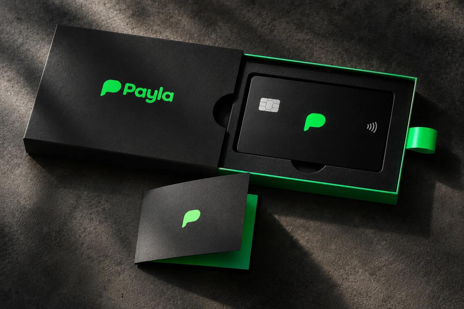
A rounded 'P' that doubles as a speech bubble, electric green on black, and a card design with nothing on the front but the mark.
- Fast
- Trusted
- Effortless
The identity.
Mark, colour and type, pinned to one board.
Aa
Display A rounded geometric sans
Body The same, with a matched Arabic
- Black#0a0a0a
- Electric#39e27a
- Mist#e9efec
- Graphite#2a2a2a
How we did it.
Four moves that make the brand what it is.
- 01
A bubble, not a coin
The symbol is a speech bubble shaped like a P: paying is talking.
- 02
Green on black
One electric green on near-black, with white for clarity. No gradients, no glass.
- 03
A card you'd photograph
Matte black card, green mark, nothing else on the front.
- 04
Arabic and English, equal
A bilingual type system where both scripts share one weight and height.
In the world.
The identity on the things people actually touch.
The feed.
Nine posts that read as one brand at a glance.
Payla
Fintech payments app
Send money like sending a text.
A content system, not nine pictures: product, type, colour and detail posts in a fixed rhythm, so the grid stays Payla whoever posts next.
Delivered.
Everything the brand needs to launch, in files the team can use the same day.
- Symbol and wordmark
- Payment card
- App UI
- Launch campaign
More in tech & saas.
2 brands in this group, each in its own style.

Want a brand like Payla?
Tell us about your business in two minutes. We reply within a day with a clear direction and a quote.