AI assistant app · Modern tech
Lumio
An AI app that feels calm, not robotic.
The brief
An AI assistant startup wanted to avoid the cold, chrome look of its category and feel like something you'd open at night without flinching.
The idea
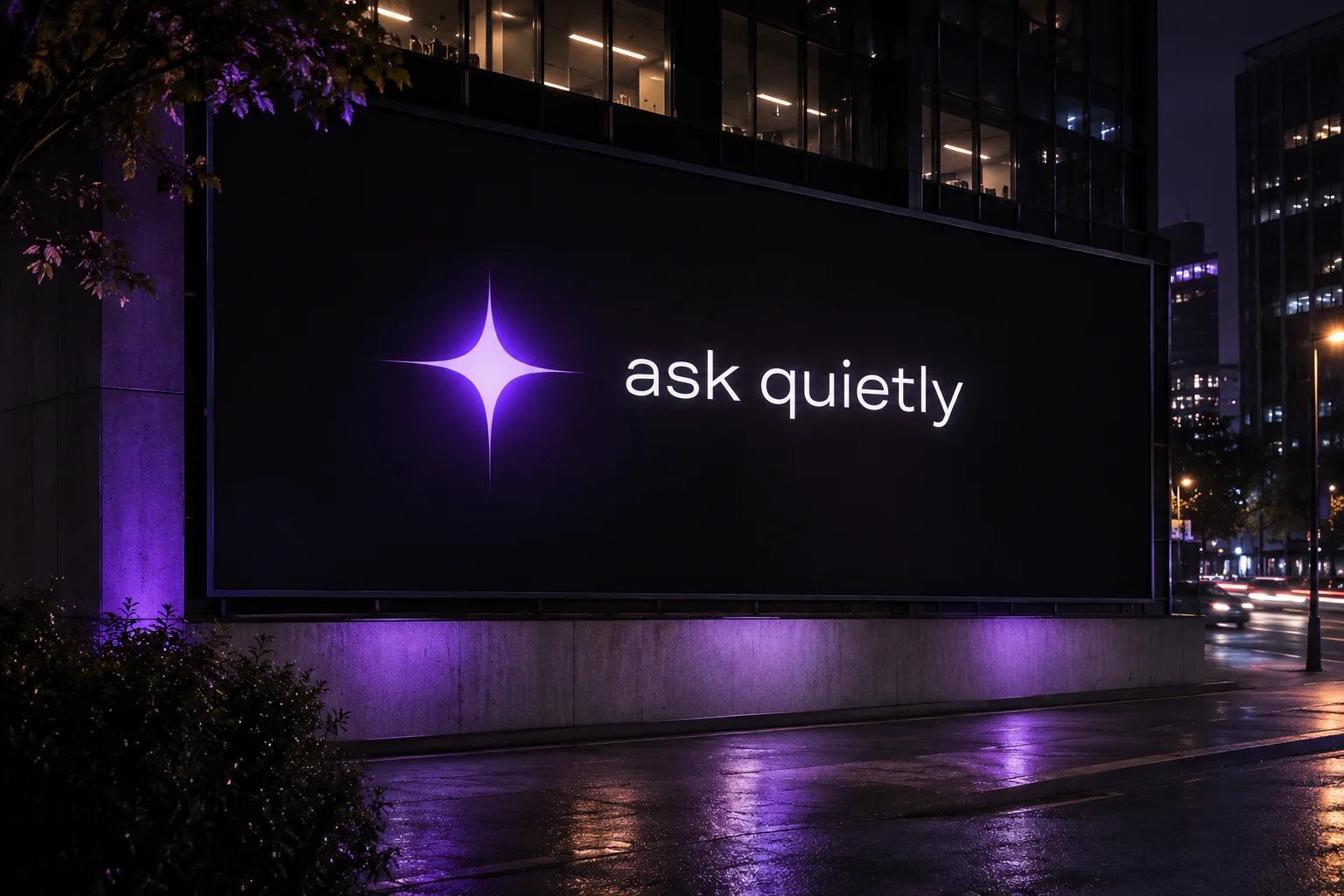
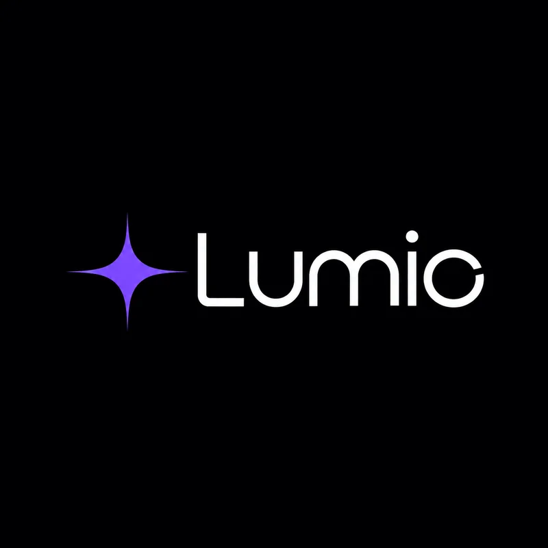
A four-point sparkle that glows rather than shines, ultraviolet on near-black, and a soft geometric wordmark with wide, calm spacing.
- Sharp
- Glowing
- Futuristic
The identity.
Mark, colour and type, pinned to one board.
Aa
Display A light geometric sans, widely spaced
Body The same family, regular
- Void#0b0a12
- Ultraviolet#7b4dff
- Haze#c9b8ff
- Frost#f4f2fb
How we did it.
Four moves that make the brand what it is.
- 01
A sparkle, not a brain
One four-point star symbol that works as app icon, cursor and loading state.
- 02
Ultraviolet glow
Deep near-black with one violet light source. Haze, not gradients.
- 03
Calm type
A geometric sans set light and wide, with lots of air.
- 04
A physical world
Flags, jackets, pins and lanyards, so a software brand has something to touch.
In the world.
The identity on the things people actually touch.
The feed.
Nine posts that read as one brand at a glance.
Lumio
AI assistant app
An AI app that feels calm, not robotic.
A content system, not nine pictures: product, type, colour and detail posts in a fixed rhythm, so the grid stays Lumio whoever posts next.
Delivered.
Everything the brand needs to launch, in files the team can use the same day.
- Symbol and wordmark
- App icon and UI
- Launch campaign
- Merch and signage
More in tech & saas.
2 brands in this group, each in its own style.
Want a brand like Lumio?
Tell us about your business in two minutes. We reply within a day with a clear direction and a quote.