Wellness clinic and spa · Luxury
Sanctum
Medicine, at the pace of a spa.
The brief
A longevity clinic combining medical testing with spa treatments wanted a brand that felt clinical enough to trust and calm enough to stay in.
The idea
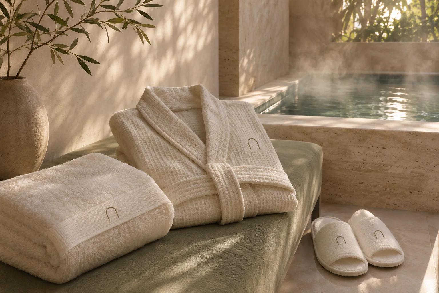
Stone, sage and a thin serif. An arch symbol borrowed from the building, and photography of light on textured surfaces instead of smiling models.
- Calm
- Precise
- Quiet
The identity.
Mark, colour and type, pinned to one board.
Aa
Display A thin, high-contrast serif
Body A light humanist sans
- Travertine#d9d0c3
- Sage#8e9b8a
- Warm white#f7f4ee
- Bark#3f3a33
How we did it.
Four moves that make the brand what it is.
- 01
The arch
A single arch as the symbol: a doorway, a threshold, a quiet place.
- 02
Stone and sage
Travertine, sage and warm white, with no bright accent at all.
- 03
Light, not faces
Photography of light moving over stone, linen and water.
- 04
Paper that feels
Uncoated card, blind embossing and a thin serif for every touchpoint.
In the world.
The identity on the things people actually touch.
The feed.
Nine posts that read as one brand at a glance.
Sanctum
Wellness clinic and spa
Medicine, at the pace of a spa.
A content system, not nine pictures: product, type, colour and detail posts in a fixed rhythm, so the grid stays Sanctum whoever posts next.
Delivered.
Everything the brand needs to launch, in files the team can use the same day.
- Arch symbol and wordmark
- Stationery and embossed cards
- Treatment menu
- Signage and wayfinding
Want a brand like Sanctum?
Tell us about your business in two minutes. We reply within a day with a clear direction and a quote.