Real estate developer · Luxury
Aventa
Buildings that age well.
The brief
A boutique developer of low-rise residences in Dubai wanted a brand that spoke to buyers tired of glass towers and gold lettering.
The idea
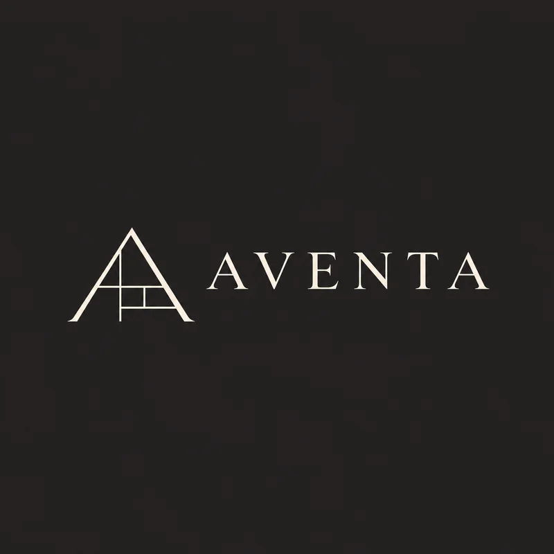
A monogram drawn like an architectural section, charcoal and bronze on warm stone, and photography of material close-ups rather than renders.
- Calm
- Crafted
- Lasting
The identity.
Mark, colour and type, pinned to one board.
Aa
Display A refined transitional serif
Body A neutral grotesk
- Charcoal#2a2a2a
- Bronze#9c7a4a
- Stone#e8e1d6
- Warm white#f7f3ec
How we did it.
Four moves that make the brand what it is.
- 01
An A in section
The monogram reads as a roofline and a floor plan at once.
- 02
Charcoal, bronze, stone
Warm stone backgrounds, charcoal type and bronze only for the mark.
- 03
Materials, not renders
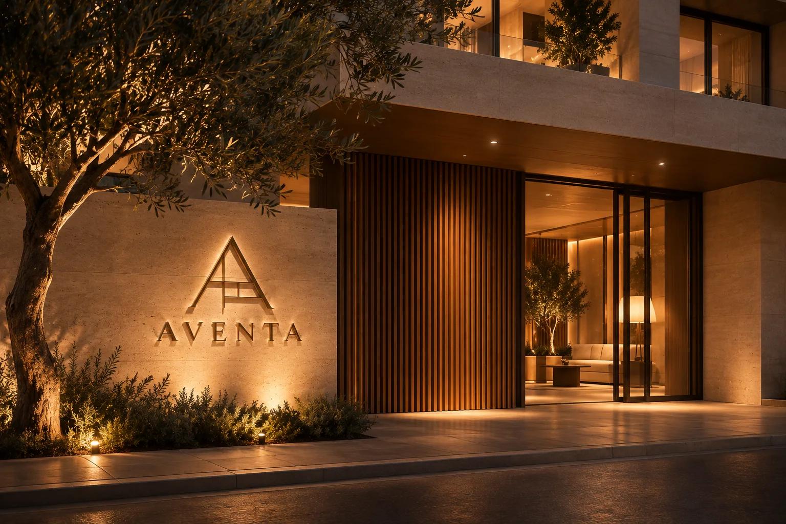
Travertine, oak and brass shot close, so the brand feels built.
- 04
Hoardings as galleries
Site hoardings designed like museum walls, with one line and one image.
In the world.
The identity on the things people actually touch.
The feed.
Nine posts that read as one brand at a glance.
Aventa
Real estate developer
Buildings that age well.
A content system, not nine pictures: product, type, colour and detail posts in a fixed rhythm, so the grid stays Aventa whoever posts next.
Delivered.
Everything the brand needs to launch, in files the team can use the same day.
- Section monogram
- Brochure and stationery
- Site hoardings
- Sales suite signage
Want a brand like Aventa?
Tell us about your business in two minutes. We reply within a day with a clear direction and a quote.